Hi... You're probably wondering about the absence of a card two weeks in a row. Last week I just couldn't get to my work station to make a card. Not in physically being able to get down to the studio but as in not being able to find it when I got there. I've spent the weekend doing some major cleaning, pitching, organizing. It looks MUCH better. I have an entire cabinet for my mixed media supplies as well as the rolling tote for 'stuff on the go'.
So what about this week's?
This week is 'tickle a teapotter'. I don't participate in that 'sister' group and since I'm leaving tomorrow morning for a mini vacation with my hubby, I decided I wanted a relaxing bath and time to pack rather than :::: gasp :::: make a card.
Instead, I invite you to travel with me to beautiful Eureka Springs Arkansas. If you're a fan of the TV show, Ghost Hunters with the TAPS team, then you may have seen the episode where they visited The Crescent Hotel. The Crescent is known as the 'Grand Old Lady' of the Ozarks. I pay her a visit every time I'm in town... which is at least a couple times a year. I've also had 'experiences' in the hotel. Not all of the entities residing there are pleasant.
If you ever need a vacation, a place to get married or honeymoon, I recommend Eureka Springs. And if you want a real comfy hotel where they treat you extra special, then make your reservation at The Best Western Inn of the Ozarks. Randy and his staff will make sure your stay is all it should be... home away from home. I've been visiting ES (as the locals call it) for almost twenty years and Inn of the Ozarks is the only place I stay.
I do have a Recycled Wednesday item almost completed and should have it ready to post sometime on Wednesday. I can't wait for you to see it so make sure you come back and visit when there really will be a picture... I promise!
Tuesday, July 31, 2012
Monday, July 30, 2012
Bewitching Magazine Monday
I know it’s a little early for Halloween cards but when I saw the BeeWitching card in the October 2009 issue of Scrap & Stamp Arts Magazine. The designer, Chelsea Comer, created a beautiful card with black ink on the CB Swirls folder using the ‘letterpress’ technique. And the Bee Witching stamp by Great Impressions is just too cute – and unfortunately no longer available. Picture a bee with a witch’s hat riding on a broom similar to this OWL.
Chelsea did a vertical card, the image mat in the upper right corner. Along the bottom she used a black strip of CS with three orange brads positioned on the right end for balance.

I have a embossing folder I fell in love with last fall but hadn’t used yet… Fall Fence by Sizzix. I inked it up using Memento Tuxedo Black and used the textured side of SU Pumpkin Pie. I used the Best Witches stamp (SU Retired)… positioning like the moon in the upper right corner. Due to the amount of detail on the cord itself, I used the fence to replace the CS strip. If I were using this to decorate a scrapbook page I might have added a pumpkin-shaped button over one of the embossed ones. I just don't use a lot of hard embellishments on things that have to be mailed. But come Halloween, it will be a treat for someone to find in their mail box.
Creative Blessings!
Wednesday, July 25, 2012
Recycle Wednesday - A Memory

The year Bob and I were married, his dad was diagnosed with cancer. It was a rough time for all of us to hear that word, but especially for Bob. He is the oldest of five and Dad’s namesake… Robert W. Henkins III. Dad had to retire. For a man used to working long hours at his regular job, Dad had a lot of outside interests. One was doing interior house remodels. He was always working with his hands. So he was forced to find something to do with them. He crocheted and someone gave him a muslin candlewicking blanket top of various types of birds. He couldn’t get into it. And if you’re curious, he eventually began woodcarving and built a dollhouse. We treasure some of his hand-carved miniature gun replicas.
Over time, the candlewicking pattern faded but I couldn’t bring myself to let go of the muslin. I loved my father-in-law and this was a part of his journey I wanted to keep.
One day, while cleaning out my sewing room I found the fabric and a box of my husband’s worn-out Jeans. I knew these two fabrics belonged together. It became a Christmas present for Bob that year. I still have to bind and tack it, but I had to give it to him just the way it was. I just haven’t found ‘the’ fabric to bind it with. It’s now become a priority for me to finish and get out of the sewing room.

The quilt consists of triangular pieced blocks of the muslin, recycled denim and a coordinating flannel I purchased new to bring it all together. The backing is also of the same muslin. The over-sized lap quilt is 6 blocks by 8 blocks. I’m hoping to find the binding and have it done in time for Bob to take to deer camp this fall. Wish me luck!
Monday, July 23, 2012
Magazine Monday! - Rainbow Birthday!
I found an article in the May/June 2007 issue of RubberStamper (now Crafts n Things) called Drags to Riches. The designer was by Candy Davis (only search results for Candy gave me links to a nude model from England hehe) So I apologize for not being able to link to the artist.
Candy made a very easy card POPPING with color! It will make a perfect birthday card for someone.
Working with a 4.5x5 card front:
Cut your yellow mat 5.25 x 4
White mat – 5”x3.75”
Cut a piece of CS 2” x 1.25” . Use a piece of repositionable tape to mask it into the center of your card front.
You can do the technique a couple of ways.
1) Use spots or ink petals
2) Makeup sponge and standard ink pad.
Candy used the full-sized ink pads from SU and just drug one corner across the card front. I used the spots.
Drag your ink pad from the center of the mask out to the edge of your card front. Candy used YoYo Yellow, Real Red, Brilliant Blue. She also used a piece of ¼” Real Red grosgrain ribbon through the center horizontally. I chose not to use any ribbon on mine
When you've completed your way all around the card, remove the center mask and stamp your sentiment.

For my colors I wanted something a bit more pastel. I used Daffodil Delight, Melon Mambo and Tempting Turquoise. My Birthday stamp is from Katie & Co. I could have run something around the center, and I still might - depending on who it goes to. I can tell you it doesn't look as 'plain' in person as it does here.
Creative Blessings!
Kelly
Sunday, July 22, 2012
Sunday Special!
Sunday's are my day to be creative. I spend time on blog hops (where you can WIN FREE STUFF and be INSPIRED).
This morning I am traveling around the Blog Hop sponsored by fellow PBU member Martha and her Creating Is Fun teamed up with Shabby Scraps! One of the blogs linked me to a GiveAway from Ingvild Bolme. She is CELEBRATING the revamping of her blog design with lots of new pretties from CHA.
Who doesn't want a Mountain of NEW Prima products for FREE!

So why are you still here! Good Luck!
This morning I am traveling around the Blog Hop sponsored by fellow PBU member Martha and her Creating Is Fun teamed up with Shabby Scraps! One of the blogs linked me to a GiveAway from Ingvild Bolme. She is CELEBRATING the revamping of her blog design with lots of new pretties from CHA.
Who doesn't want a Mountain of NEW Prima products for FREE!
So why are you still here! Good Luck!
Thursday, July 19, 2012
The Salt Technique

This card was made using the Salt Technique for the background. The DP is SU, the green CS is Aspen (from Archivers) and the image is from the new SU catalog, Harvest Blessings
Today we’re playing with SALT. If you’ve never tired the salt technique, it’s pretty cool and really easy. The only note is that you have to plan ahead as this needs to sit overnight before you use the paper.
You’ll need:
A sheet of Glossy cardstock
A full-size ink pad (you can use a small one, but it will take you a little more)
A brayer
At least 2 types of salt (I used Rock, Sea and Table salt)
A mister bottle with water.
Cover your work surface with a sheet of paper larger than your piece of glossy cardstock. I used a full 8.5x11. If you want to work with just your mat size, that’s cool.
Using your brayer and your ink pad, coat your brayer with the ink.
TIP: As you roll the brayer over your ink pad, roll it forward, pick it up and come back to your starting point and repeat several times until your brayer is covered. This allows your brayer wheel to get a clear spin and a complete coat.
Roll your brayer back and forth over your CS, just as if you were using a roller to paint your wall. You want a nice even coat. You will have to recoat your brayer a few times in this process.
When your CS is coated, spritz it with water. You want it wet but not ‘soaked.
Sprinkle the salt crystals randomly across your CS. I started with the larger crystals and worked my way down to the smaller ones.
Set it aside to do it’s magic overnight. As it dries, the salt crystals will absorb the ink, leaving you with this ‘mottled’ background affect.
I did this one with Tangerine Tango. It was the only large ink pad I had in orange. I wanted to do a sheet of orange and a sheet of purple (I used Concord Crush)
This is what it looks like when it’s dry:

Tip your paper up on edge and tap off the salt and discard. Next, take a soft cloth to gently wipe away any remaining salt. I did wind up with a couple splotchy areas but they were easy to cover up with a image mat as you can see from the card above.
Now your Salt background paper is ready to use!
Have Fun and be Creative!
Wednesday, July 18, 2012
Recycle Wednesday
The neat thing about altered journals is you can do whatever you want. You can have all hand art work, collage, hard and soft ephemera. They can have a theme or be a mixed collection of whatever comes to mind. You can make them just to be browsed through or interactive. They are YOUR creation and they should reflect YOU. In my opinion, that is the only ‘rule’ to art journaling.
I like a theme. Though we’ve talked earlier about me trying to break out of the OCD mode a bit when it comes to my art and I want to do a ‘rambling’ kind of journal soon. But this particular book I’m working on now has a theme. ME. Being a writer, I wanted it to incorporate words, letters, and anything else that describes me.
Looking through the book I hope you’ll see that I like Vintage. The other things I like will be showcased through collaged words, phrases, quotes and tags. You’ll also see I like things that are torn and interactive. I want you to enjoying your journey through my book as much as I had creating it.
To make a book interactive, you need to have things that move. I have mine broken down into 2 categories: pockets with tags and things that open. Today is all about pockets.
In this book I’ve created five types of pockets. The first is a single pocket.
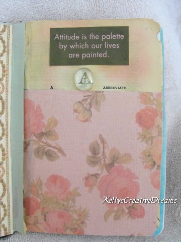
This is suitable for one tag or pull-out. I’ll set the town with my A pocket by inserting the A tag from the A-Z swap.
Then there’s the Multi-depth pocket.

This shows 3 staggered pockets on the right hand page. Each pocket is slightly shallower than the one below it. Whatever I choose to slip into the pockets will be partly visible, making it part of the overall layout.
The Double pocket.

Here I’ve created a diagonal pocket, then I’ve layered a second pocket over it from the bottom of the page. It’s works like any other pocket in it’s use, but it does provide a different perspective in the layout.
The envelope pocket is great for adding in additional smaller pages within a layout.

I’ve created a triangular shaped book to slide into a pocket on either side of the spine. I’ve mimicked the shape in the design of the page itself.
The Up and Down pocket.

This is one of my favorites! Because it’s different. In the Up and Down pocket, you’ll notice on the left-hand side you’ll see that a tag would pull out from the top of the pocket but on the facing page it pulls from the bottom. Just another way to look at things.
The final one is just for added interest on your spread. It runs across the spine.

It is glued down at the upper and lower corner. The rest of it is open all the way through as you can see from the skewer I’ve stuck in there. I’m not sure what I’ll use it for. I could choose to layer something in the bottom left corner, overlapping the center piece just enough to prevent whatever I stick through the top from going all the way through. As I begin adding the actual items to the book, it will tell me.
Next week… Moveables and where to find the ‘extras’ that will bring your book together.
Creative Blessings
Tuesday, July 17, 2012
Teapot Tuesday
I haven't had time to put together a card for this week's TPT. Still getting caught up in that area. It will take me a couple weeks to be completely in the swing.
I do have the pics resized and ready to go for tomorrow's Recycle Wednesday post. We're talking about the pockets for the ABC book. I hope you'll join me!
Creative Blessings!
I do have the pics resized and ready to go for tomorrow's Recycle Wednesday post. We're talking about the pockets for the ABC book. I hope you'll join me!
Creative Blessings!
Monday, July 16, 2012
Magazine Monday
Happy Monday, everyone!
I spent a blissful afternoon in the Studio yesterday. I thumbed through magazines and found all the card inspirations I’ll need for every Monday through 2012! And made several of them, besides. I should have taken time last night to get today’s post together but until my husband called around 9:30 last night, I had no clue what time it was and suddenly very tired. I love how I can get lost in my creative world.
Today’s card was inspired by Cynthia Hillstrom’s card, You’re a Dear Friend, featured in the May/ June 2007 issue of RubberStamper Magazine (now under Crafts n Things). Cynthia used mostly Close to My Heart products. Her base was a mottled blending of cherub pink, baby pink, shell pink and lavender. She used a varigated pink/ white checked ribbon and 3 pink heart brads.
I liked the layout just as it is. I don’t do 4x9 cards very often and this one just spoke to me. To fill the long slender white mat, I instantly thought of SU- Nice n Narrow stamp set. This particular set has the flower, baby carriage and a Christmas tree. I need a card for my MO monthly stamp loop and thought the flower and a bright yellow would bring a Happy Hello to my recipient this month.

I used SU Daffodil Yellow, misc. yellow grograin ribbon and LePlume markers. The sentiment is from SU Lots of Thoughts.
Creative Blessings!
Kel
Friday, July 13, 2012
Scrapbook Friday - The Stuff
I've decided I'm ready to start getting some of the scrapbook projects done. I've been holding on to/ collecting stuff for way too long. It's time to put them into albums. So every Friday I'll be showing you a layout or two I'm working on... beginning next week.
This week I want to introduce you to my first project. We've lived in this house for five years. I've been collecting pictures, papers, embellishments, etc when we first bought the house eight years ago. Pictures of the place when we knew it was the home for us, the remodeling process, floor plans and designs I drew up, receipts for everything. Yeah, I've collected a lot of...


This week I want to introduce you to my first project. We've lived in this house for five years. I've been collecting pictures, papers, embellishments, etc when we first bought the house eight years ago. Pictures of the place when we knew it was the home for us, the remodeling process, floor plans and designs I drew up, receipts for everything. Yeah, I've collected a lot of...

STUFF!
I've always known I didn't want the album to be your standard shape. I've decided to work with an 8.5x11 album... flipped horizontally. If it will work I'll have pics to show you next week of how this will give me a 3-page spread to work with. For now, let's break the STUFF down to manageable categories.

The Pictures
I have a LOT of pictures. They're the reason for doing this, right? I'm sure as I begin to scrap, not all of them will be used but I like a variety to choose from.

The Papers
Like any house, you need a good foundation. I have specifically chosen some papers for the album theme. I'll add SU cardstock and a coordinating DP from a variety of vendors.

The Decorating Elements
I had so much fun choosing what we would use in the home to make it 'ours'. We still have a long way to go but it was an enjoyable experience to browse through home improvements stores, look at paint books/ chips and bring home samples to audition. Now that the house is done (except for our bedroom), I'm using the same process to design The Studio.

The Embellishments!
I love adding the final touches to my creations whether it be a card, journal or scrapbook page. Aside from stickers, I also have the HandyMan Cricut cartridge and some really cool brads that look like standard and phillips head screws.
This album is going to be sooooo much fun. Come on inside and follow along on the remodel of our Dream Home!
Creative Blessings
Kel
Kel
Thursday, July 12, 2012
Technique Series #1 - Bubble Wrap!

Beginning today, I’ll be showing you my take on techniques from: CREATIVE FOUNDATIONS: 40 Scrapbook and Mixed Media Techniques to Build Your Artistic Toolbox By Vicki Boutin By no means does what I show take the place of anything Vicki 'details' in her book! The woman is amazingly creative and offers additional tips and variations along the way. The photography for the book is beautifully done. I'm just showing the possibilities of what you can do with every-day stuff. But grab Vicki's book and take it to the sky!
I’ve always been a very structured person. I wanted to be freer on my creative path but the OCD in me held the upper hand. Lately, my creative life has been all about playing. I’ve been immersing myself in mixed media tutorials, books and web pages like Kellie Rae Roberts, Michelle at The Paper Dog and Roberta's Con Tain It. I look at everything around me through new eyes.
Even Bubble Wrap!
This technique is incredibly easy but provides a cool background for cards, ATC’s and scrapbook layouts.
Vicki’s tutorial used two sizes of bubble wrap – the quarter size bubbles and the standard. She also used two varying shades of blue acrylic paint. I wanted to work with blue, also, but only had a Navy. So I improvised. It’s that ‘freedom’ thing I’m trying to work on. ;-)

SUPPLIES:
Nonstick craft mat or piece of plexi glass (about 5x7) or large flat glass plate
for a braying surface
Acrylic paint
Brayer
Bubble wrap
White cardstock (good quality like GP)
Spray Ink
You’ll also need basic card making supplies:
Paper trimmer, adhesive, images/ stamps
For the Spray Ink, I used a 3-oz mister bottle about half full of water. I added 4-6 drops of SU Brilliant Blue (retired) reinker. Start with only a couple of drops, mist for a color test and add more until you achieve your desired shade.
CREATING THE BACKGROUND:
Squeeze some acrylic paint on the braying surface. Roll the brayer through it to get an even coat.

Brayer a thin layer over the ‘bubble’ side of the bubble wrap. (See pic at top of page)
Turn the painted bubble wrap over and place paint side down on the white cardstock. Carefully lift off. Repeat the process to cover the entire surface. You can overlap the images and turn the bubble wrap different directions to achieve an ‘all over’ pattern.

When you are finished, let it dry completely. A hair dryer will speed the process. I find the heat gun to be too hot for this. When it’s dry, holding the spray bottle about 6” from your printed surface, spritz with the spray ink. Let dry.

From this point you can cut your background for your projects. I’ll get several mats in varying sizes from this 8.5x11 sheet. For this project I cut a mat to fit the 4x5.5 card as well as smaller mats for image/ sentiment and several ATC’s.
TIP: If you plan to work directly on a 12x12 background for a layout, think about the placement of the items you’ll be using in the layout when printing your bubble wrap.

PROJECT:
Bubbles and blue told me water for this project os I chose a seahorse image from InkaDinkaDo and a simple sentiment. The ribbon is Offray MicroSpool Self-adhesive ‘bubbles’.
Play! Have Fun!
Creative Blessings!
Wednesday, July 11, 2012
Recycle Wednesday
I'm not sure why, but most of my recycle always involves a book. Hmmm wonder if it has anything to do with me. As a writer, books are precious and I can't bear the thought of them ending up in a landfill when they can be re purposed.
The project I'm introducing today actually began as a Altered Art class I taught at Michaels about seven years ago.

I started with an old dictionary that was falling apart. The theme is to use the letters of the alphabet that describe me or things I like. I love all things vintage so went with a soft color pallet. I did notice as I looked back through the book this morning, I've used a lot of Anna Griffin papers. I love the colors and designs she uses in her products. We're both old souls when it comes to our likes, I think.
This was also my first step into the world of Mixed Media and Collage, which I am falling madly in love with.
Last year I took part in an A-Z tag swap and I thought what a perfect addition the tags would be to this project.
Each letter of the alphabet has it's own 2-page spread plus four additional 2-page spreads. This will allow plenty of room for pictures, pockets for notes/ tags and quotes under each letter. Here is my opening spread for the letter A:

I want to finish this project. So the second Recycle Wednesday of each month will be a progress report until I can show you the finished project.
I've already thought about how I'll use 2 of the remaining page layouts. Can you guess? Leave me a comment as to what you think 2 of the 2-pg spreads will be used for. I'll pick a winner next Wednesday to receive a Ephemera Art envelope of goodies.
Creative Blessings!
Kelly
Tuesday, July 10, 2012
Teapot Tuesday!
Yep.. I'm here with my first Teapot card in weeks. I knew the technique I wanted to use and once I read the challenge, picking stamps was easy.

When I read Heath's story I knew Nobel Deer (retired SU) would have to be included. Heath loves to hunt. He may live in Oklahoma but I think he's an Ozarks man at heart. I recently learned about the Triple Time stamp method through my Missouri stamping group. The technique is shown by dostamping on YouTube . Dawn has a wide range of fabulous tutorials on YouTube.
The concept is to lay all of your light-tone mats on top of each other (without their colored cs mats), stamp your image, then go back and layer them with the CS mats. It adds a neat dimension to the card. Here, the big buck seems to be walking out of the timber (created using Lovely As A Tree). I matted GP white on SU Always Artichoke. The deer and sentiment are stamped in Chocolate Chip and the trees with Always Artichoke. I added a bit of twine to suspend the 'FAITH' charm from, as Heath is strong in his faith. The scallop circle is Paper Studio 1 7/8". The sentiment is from the Floral Wreath set by Gina K Designs.
It felt great to be back in the Studio today and I look forward to playing again and bringing you lots of inspiration!
Creative Blessings!
Monday, July 9, 2012
Magazine Monday.... sort of.
Okay, no picture today. Just a note to let you know I'm back.The work table has been cleared and I have a challenge list a mile long to play with so cards will be flowing soon. I'm hoping to start with a TeaPot Tuesday card tomorrow and get things rolling again.
But in the mean time, I wanted to let you in on what's coming up over the next few weeks on the blog so you can plan now to not miss a beat.
Although I had very little computer time while Adrian was here, I did have 'book' time in the evenings. Quietly tucked under my covers with creative books to keep the juices flowing until I could play for real.
If you'd like to do some book shopping, I've included the titles as links to make it easy for you to have the reference material and follow along.
One of the books is Creative Foundations - 40 Scrapbook and Mixed-Media Techniques to Build Your Artistic Toolbox By Vicki Boutin. I was first struck by the artistic look of the cover. The picture showcases a lot of things I like to play with when I'm in my studio.
For now, those posts will run on Thursdays as part of my Mixed Media postings. At the bottom of each post I'll run the supply list for the following week so you can see if there's anything you might want to pick up over the weekend and have on hand when the new tutorial posts. They are all EASY to do, have very few steps but create quite a punch to your project.
The other book is by Creating Keepsakes titled: The Organized & Inspired Scrapbooker by Wendy Smedly and Aby Garvey. Neither of these ladies are strangers to the scrapbooking community and have tried and true advice to help make your scrapbooking life easier, no matter where you're creative space may be.
Many of you know I've been creating my 'perfect studio' for months. I still don't have an actual room or building, but my current space allows me to 'test run' ideas I come across. By the time I have the Studio, I'll know exactly what I need and how it needs to go together. Knowing some things ahead of time is a HUGE help to the guy running your electricity. :-)
So in September, be prepared to learn the difference between 'organized' and 'storage'. They really are two very different aspects that will make your creative life easier.
So check back tomorrow to see what I've finally had the opportunity to create and let's have some FUN!
Creative Blessings!
Subscribe to:
Posts (Atom)