I know I should have a card to share with y'all today. I've just been so focused on fiction writing again. It's felt really good. I've completed the rough draft of my new novel in 15 days! I love when the words pour. I'll know in January how many are salvageable.
I am taking the month of December Off. I need to revamp the office, my work schedule and a couple other things so that I can be more productive in all areas while still trying to enjoy the Holiday.
I hope all of you have the most blessed Holiday season.
See you on January 1st with a whole new routine!
Creative Blessings!
Kelly
Thursday, November 22, 2012
Tuesday, November 13, 2012
TEAPOT TUESDAY for Marylou
I spent a bit of time in my studio yesterday. I had almost forgotten how much fun matching up images, cardstock with the right bling, and fibers was. But I knew I had to attend the Tea Party. Marylou is a wonderful woman with so much medical strife in her life.
I met Marylou several years ago at my friend, Soni's house. MaryLou is her sister-in-law. We bonded over our love for of all things, BEARS. She fell in love with my vintage Binkle Bear and tried the entire afternoon to talk me out of it. So it comes as no surprise bears figured into our Teapot challenge. You can read about Marylou HERE
Thank you, Soni for bringing MaryLou to the party.
Marylou not only loves bears but the colors blue and purple, vintage and her Faith. It helps that she's married to a minister. Bill is one of the kindest people you'll ever meet and devoted to his wife.
So today's cards are for Marylou. May she be flooded with love and good wishes.

I used SU Concord Crush and Very Vanilla. The base vanilla is embossed with Starry Night and I used the mini oval framelit to showcase the Teddy Bear by Stampbendous. I stamped him in Memento Rich Cocoa. The Hello in the center of the flower is from a flower set by Stampendous. I added bling, vintage lace and frilly fiber.
Big Bear Hugs for MaryLou
Creative Blessings
~Kelly
Monday, October 15, 2012
Magazine Monday - Horse Frame
Welcome to Monday!
I'm just back from a 4-day writers conference in Eureka Springs AR. I look forward to this weekend every Oct. Unfortunately, Abby's birthday will almost always fall the same time and I won't get to go as often - breaking a 19-year attendance streak. But my Cupcake and Tootsie pop (Adrian) will always come first.
I spent part of World Cardmaking Day working on supplies from swap envelopes. I belong to a group on SCS. Each month we take a turn at sending out an envelope of goodies to everyone else on the list. We combine the components of the envelope with our own stash to see how many cards we can make. Sadly, I am WAYYYY behind (like 2 years worth!) of getting cards made. I decided to start with my most recent envelope and work my way backwards. Well, except Sept. envelope should have been from Amy and I couldn't find where I had put it when I carried it in from the mail box. All the other envelopes were filed where they were suppose to be so I started with August - from my friend Shell.
Shell and her daughter, Jaydin, are becoming quite adept at horse riding. Jaydin is a natural and loves horses. So Shell kept to a horse theme and sent us lots of goodies to play with. I came up with six cards from her envelope... one of which I'm showing off today.

Shell sent the twine, the brad (Spare Parts) and the green embossed background. I ran a piece of SU Chocolate Chip through my Paper Studios EB to mat the horse oval. I used Derwent WC pencils to color in the horse (Clear $ Stamps - Just Horsin' Around) . I think of it as a remembrance tribute to a faithful friend.
This card also applied to the SCS Sketch Challenge SC48
Wednesday, October 10, 2012
Recycle Wednesday - Needle Book
Okay, this isn't necessarily a recycle project as it is a repurposing.
I love to sew. I don't know a lot about some things as much as I should. One of those is the proper sewing machine needle to use for specific fabrics. The other thing is I have a needles for different fabrics but they're all kept in one ziploc bag. While watching Fons and Porter's Love of Quilting, I saw a tips segment where a gal kept her needles in separate jewelry bags and then all of the bags in a plastic hard case index card holder.
Not bad... at least they're not all piled together to be sifted through like a deck of cards.
Then last year while in Paducah KY I found an issue of Simply Homemade - a crafting magazine from the UK. I love their magazine because you always get more than just a magazine. This issue came with the cutest set of stamps from NitWit Collections. They also had a beautiful collection of papers and cut-out embellishments from their Thimbles and Threads line.
So this is what I started with:

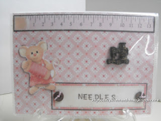
If you look in the right of the brag book, you'll see a glimpse of the project they had in the magazine made from a chip board album. I needed pockets to put my needles in so I picked up a generic brag book for $1 at Dollar General. I'll use the first couple of pages to put a chart showing which needle # works best for which fabrics. Then the rest of the photo pockets will hold the different needle sizes. I also plan, once the needles are in place, to use scraps from the papers to label the pages with the coordinating needle size so I can put them back in the right spot when I am finished with them.
I didn't use the clear stamps you see in the bottom left corner - just the papers/ cut-outs they provided.
I photocopied some of the cut-outs to white CS so they'd be a bit stronger and I'd retain my originals for now.
Here's what I came up with:

The tape measure, the mouse, the base paper and the mat are all from the magazine packet. I added the buttons and stamped NEEDLES using Hampton ART stamps. The sewing machine is from Jesse James Buttons.
Now to get the needles put away. :-)
Tuesday, October 9, 2012
Magazine Monday - Happy First Birthday, Cupcake!
Yep, it's been one of those weeks already. And still so much to do before Thursday.
Today's card was inspired by Jen del Muro. I didn't realize until I searched for Jen's website that she is one of my favorite people at SCS. You can see Jen's gallery of creativity HERE. I always think girly-girl when I see Jen's cards, though they aren't necessarily all pink and frills. Maybe it's her smile.
In the Summer 2009 issue of Paper Creations Magazine, Jen showed us the Inner Princess. She used several shades of pink CS, paired with dotted patterned paper and scalloped edges to make an adorable 'princess' card any little girly girl would love to receive for her birthday. The sentiment, from Elzybells Art Stamps (closed in 2010 but may be found on eBay) proudly encourages to 'celebrate your inner princess'. I kept pretty much everything about Jen's layout the same. She did use a ribbon and bow on the bottom rectangle (below the circle) and 3 pink baubles to the bottom right corner. Since this card is going to my Granddaughter, Abigail, I chose to leave those things off and keep it simple. She turns ONE on the 13th and we know how they like to rip into things then put the pieces in their mouth.

I've always called her my little cupcake. So I chose the cupcake stamp from Studio G. The sentiment is actually part of a 3-stamp wedding set I bought at $Tree several years a go. But any birthday is a BIG DAY for a child. The cupcake and sentiment are stamped in SU Chocolate Chip. Then I colored in the cupcake swirl with a Brown perma marker and the cherry with Red. For the cupcake liner, I used a Pastel Pink.
The papers and the 'ribbon' trim are from SU - DP Ice Cream Parlor and the CS is ValuCS - Garden
collection. The .card will be a couple days late for her birthday, but then so will Grandpa and I
Thursday, October 4, 2012
Gelato Technique
I’m finally getting some time to play with the Gelatos and show them off.
These particular Gelatos are from Faber-Castell. FC makes a wide array of products… everything from a basic #2 pencil to expensive pens. But when it comes to their art product, like SU, they make them to work together. Whether you’re working with their colored pencils, makers or Gelatos, you can go back and forth from one to the other. However, FC is more of an ‘artist’ quality. Think the difference between Copic and Marvey markers. Gelatos have a very creamy texture, allowing them to keep their intensity.
You may purchase Gelatos in a variety of ways… by the entire color set, which includes glittery tones, as a 2pk coordinating (comes with a clear stamp so you can play right away!) or as a set with a matching pencil and marker combination. I first found the 2 packs at HL and Michaels. Of course, I now have all of them except the glitter tones. I was thrilled to find the complete set of all their colors at the stamp show in August, but couldn’t justify buying the entire set (around $60) just to get the 5 or 6 colors I don’t have. I’ll have to purchase those separately later.
As opposed to an actual project this time around, I chose to show the difference in ‘watercolor’ mediums… Derwent WC pencils, Gelatos, SU WC crayons.

Working with any of the three is very simple, but you will get different grades of effect from each. I've drawn three ovals on a sheet of paper pre-coated with white Gesso. You may skip the Gesso step by using a watercolor paper. I just have a stack of this paper I need to use so it's my 'test' paper. I'll use the ovals in future art journals. I kept to BLUE as it was the most easily matched between the three mediums.
The first one, I started with the Derwent WC pencil. I colored the entire oval in lightly, then went back over it with the water brush. You can see how the intensity changes by adding the liquid.
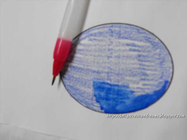 |
| WC pencil |
 |
| Completely filled in |
Next I used the SU WC crayons. I believe it is Brilliant Blue
 |
| blended techniques |
And finally, the Gelato. This is my favorite because of the creaminess. They don't lose their intensity with the water.
 |
| Gelato |
One of the best YouTubes I've found is by thefrugalcrafter. This gal is just awesome. I love a lot of her techniques in the stamping/ art field. In this particular link, I think I liked the background better before she blended it around. But what an awesome addition to using your EB folders on solid CS. She also shows how to make your own Washi tape using masking tape and Gelatos.
As I put projects together with my Gelatos, I'll show them.
Creative Blessings!
~Kelly
Wednesday, October 3, 2012
Recycle Wednesday - Cardboard?
Yep, Cardboard. So much of this stuff winds up in landfills every day, even with the number of recycle centers available nationwide. Some people either don't think, don't have time, or don't care. All three are sad excuses in my opinion. My (step) mom aka Grammy, taught me out to make useful things from stuff most people would throw away. At the time I thought it was fun. I didn't know it was out of necessity.
So when it came time to figure out the best way to store my fibers, I found big 'bobbin' cards from Cropper Hopper. Well, cool as they might be I did not have the money to package up my MASSIVE amount of yarn, ribbon, thread. You'll get an idea in a minute.
I also wanted to get a handle on it BEFORE we moved. Being pre-carded, it would be easier to pack for the move. One thing I had a lot of was cardboard. You don't want to use just any cardboard. It needs to be the corrugated boxes like grocery products are shipped in. You don't want it bending as you wrap. It's easy to 'wrap tight' without even trying on more flimsy cardboard.

Each board is about 3" x 5". The one on the right is notched for ribbon and the one on the left, for fiber's such as yarn and embroidery floss. For the real wide wired Christmas ribbon I use the same card except I only use one notch on either of the long ends... ie only one ribbon per card.
Now.. why did I need an organizations system like this?

This is one of 3 15" x 15" drawers in my storage cabinet jam packed full of the cards and filed by color. The drawers do NOT include season-specific ribbons. For those I try to leave them on their spools in themed sterilite containers. However, Christmas ribbon has a tub all it's own - separate from the Christmas embellishments.
Let's just say, I've saved A LOT of cardboard. :-D
Creative Blessings!
Tuesday, October 2, 2012
Tea Pot Tuesday
I'm doing really well at getting in here in the evening. I promise, tomorrow's post will run earlier. hehe
Normally I know what I want to do when I start a card... and it ends up very close to my original plan. Today's card fell WAY off the mark. Partly because I had seen a sketch yesterday and knew it would be perfect. Do you think I could remember where I saw it today? NO! So I tried winging it. That didn't work either.
So instead my card for Jean Linabury in Malabar FL is simple, while including the elements given in the challenge - to bring a Yellow Cat or at least the color yellow, and scripture. Jean has terminal lung and breast cancer. Seems like that horrid monster rears it's ugly head more and more as we progress. So sad. Jean loves the color yellow and is strong in her faith. Her son John, has epilepsy and is unable to travel to FL to see his mom. So our we are showering her with love and support in his stead.

The cat shows up better in person. I used scraps of ValuCardstock yellow. The cat is from Paper Crafts Inspirations Magazine inclusion sheet, stamped in SU Sunshine Yellow (ret.) The sentiment is from SU Thoughts and Prayers. The base is SU Concord Crush (ret). All the embellishments are from my massive amount of stash. I used Cricut Accent Essentials cart. to cut the labels. I cut one the same size as the cat's mat but trimmed it down to fit the sentiment.
Monday, October 1, 2012
Magazine Monday - Circles & Scraps
Happy Monday Y'all!
Yes, I'm a bit late. Instead of playing with paper and ink yesterday, I scrubbed my kitchen floor and washed all the rugs. Glamorous life we lead, isn't it. ::: smile ::: But my floor looks awesome.So today is my usual Monday business AND squeezing in some play time.
Today's inspiration card is by designer Charlene Austin. If you click on her name, it will take you to her blog. If you click on this - Paper Creations, it will take you to a profile they did when they featured her as a guest artist. To top it off, if you click on Splitcoast - it will take you to her gallery where you can see tons of her creativity in one place. Pretty neat gal!
Charlene's card was a Birthday card with a bright turquoise bow from Creative Impressions. She used 5 rows of 5 circles on her card. I had mine going a bit closer together and wound up with 6 circles and only 4 rows.
A dear friend of mine is going through some medical issues and life changes, including a new condo. So I thought I'd go with the fall colors and send him a card just to let him know I'm thinking of him.

I kind of revisited the scrap drawer again with this card. I store my slabs in the 3/4 in paper keepers from Cropper Hopper. They line up nicely on the center shelf of my entertainment center-turned - scrapbook cabinet. I have all the spines labeled so I can go right to the season/ category I need to work with. About 98% of my slabs are Die Cuts With A View aka DCWV. Did you know they also produce the Recollections slabs? Same great quality just a different label. Cool, huh?
Anyway, I store all the scraps from that slab in the paper keeper so if I just need a little something for a tab or mat, I don't have to cut into a big piece but I still know where it came from. So THOSE are the pieces I went to. All but the paint splattered looking circles came from a slab put out by Walmart called HARVEST. yeah, I know, it's WM, but they do have some pretty papers and this set I picked up at a garage sale for $1. Only a couple of pieces had been removed. I love deals!
I used SU- Chocolate Chip for the base mats and the ribbon/ bow, Very Vanilla and More Mustard. The little leaf brad is from Creative Impressions and the mats and circles were cut using the Cricut Accent Essentials cart.
Off to check out the details for tomorrow's card!
Creative Blessings!
Thursday, September 27, 2012
Computer Issues
Due to computer issues, I will not have the techniques post up until Saturday... hopefully. I really wish people with talent would use it constructively. Grrrr!
Thank you for your patience.
Tuesday, September 25, 2012
HAPPY BIRTHDAY SUE!
Yep, today my daughter turns... well, I won't tell ;-) But she has grown into an amazing woman, partner and mom. She's blessed me with two granddaughters I thought I'd never have. And I love her. This is is her card:

If the card looks familiar it's because I took one of those cards from Monday and showed how you can make up the simple cards ahead of time. Then, when you need a card, you can personalize it in minutes for that special someone.
Happy Birthday, sweetie
Love Mom

If the card looks familiar it's because I took one of those cards from Monday and showed how you can make up the simple cards ahead of time. Then, when you need a card, you can personalize it in minutes for that special someone.
Happy Birthday, sweetie
Love Mom
Monday, September 24, 2012
Magazine Monday - Happy Birthday Sue!

This week I'm celebrating our daughter's birthday. I'm starting with a simple card. On Wednesday, when she and I officially celebrate our birthday, I'll have another card for her. Sue seldom checks her snail mail so I know even if I were to priority out a card today, it might be next week before she sees it. hehe. She's a busy mom of two working full time. I hope Jeremy does something special for her on Wednesday. She's earned it.
The inspiration for this week's card - and several others I'm going to show you - came from the Summer 2009 issue of Paper Creations Magazine Card artist, Sarah Small (sorry, couldn't find a blog or web for her) created simple tile cards from Scrapworks Alphabet Stickers. It doesn't get any simpler than that. Peel, place, send.
Since I'm always encouraging my stamping friends to use their stash, I pulled out my paper stash drawer..

The drawer is approx. 15" square and holds all of my misc. paper scraps from various slabs. This does NOT include my SU DP. I keep that in the SU cabinet with the full pads.
I used the Cricut cartridge Accent Essentials to cut 1.25" scalloped squares. As I began placing my tiles I could tell I should have used 1". However, I'm on a time crunch today (thanks to a thoughtful hubby) and had to go with what I'd already cut.
The stickers Sarah used were geometric/ contemporary in design and bright colors. The stickers also included pre-stamped words on some of the tiles. I improvised using stamps I had on hand.
I also saw this technique in all patterns of papers for different occasions. Here's what I came up with:


These are great cards that serve multiple purposes:
1 - Use your stash!
2 - Have quick cards on hand for any occasion
3 - Make multiples very quickly for gift sets
4 - Great simple cards for people you know are going to toss them eventually (face it - they do!)
I'm going to make more of the Christmas design for my 2013 cards. Some I"ll leave plain while others I'll dress up a bit more.
Because many of you have asked about Gelato techniques, I'll be showcasing those on Thursday so make sure you come back!
Hubby leaves tomorrow and I'm back to my routine.
Creative Blessings
Monday, September 17, 2012
Magazine Monday - kind of.
Okay... so you will not see a card today. I've managed to mess up the alignment in my neck so I'm just not up to playing or being on the computer like I need to be on Mondays.
I can tell you I had a wonderful visit with my youngest sister-in-law, Kelli Bay, over the weekend. She purged her work area a bit and guess who brought new things home. I think the Scor Pal will get a workout. LOL She handed off several SU wheels she no longer uses. They'll work perfectly in my mixed media art work. A few stamp sets and some brush markers... yep, new toys. Also some new ideas.
We went to Hobby Lobby where I picked up some christmas ribbons ( I know - didn't need but hard to pass up) LOL and 2 pkgs of Texture Accents Samplers from Faber-Castell. Each package has a small tube of Gesso, Gel Medium and Glaze. I'll pack these away with my Gelatos and have them handy. I also got a 6x6 album in brown with pink polka dots for the Tea Recipe Swap I was in last month. I think I'll embellish the outside of the album... just not today.
Hopefully tomorrow I'll be ready for Teapot Tuesday. In the mean time, check out Kelli's blog. She's really creative. Keep checking back as I know she's done some really cute Halloween treat bag kind of things you won't want to miss!
Creative Blessings
~Kelly
Tuesday, September 11, 2012
Teapot Tuesday - Happy Birthday Eula!
Today's card goes out to an incredible lady in PA. Eula Cousins will celebrate 110 years young on September 14th. I can't imagine living to be 110. Miss Eula is still young at heart. She loves getting mail (who doesn't?), reading the letters and answering when she can.
This is my third year to send Miss Eula Happy Birthday wishes. For some reason I always see roses when I think of her. So to keep with my theme, I've sent her roses again this year. Why break with tradition!
I pulled out the Color Bok Rosewood slab. It is so vintage, feminine and romantic. All the things that come to mind when I think of Miss Eula.

I was trying to decide on a verse for the front of her card this morning. When I came down stairs to clean off the desk, there was a mat square from a previous project laying right on top of everything. Just the poem I needed for someone turning 110. So I typed it up and printed it on vellum so the DP would show through. The red trim is an edging cut from the same sheet as the background paper. I layered it with a strip of Wrights Trim. The DP is matted on SU Cherry Cobbler (my favorite go-to vintage red) then on a SU Very Vanilla card base. I ran the vellum mat through the Xyron so there would be a clear seal behind it. I added a bit of stickles to the rose petals and leaves and 3 'pearls of wisdom' to the corner.
Aside from the poem on the outside, there is a personal note from me on the inside and a quote that says... age is merely the number of years the world has been enjoying you.
The envelope is lined with a solid pattered DB from the same slab and I used accents from another piece to decorate the outside of the envelope.
We're hoping these cards arrive to Miss Eula by the weekend so she'll have them for her HUGE (approx. 500 people) birthday party on Saturday. I didn't see the email in time to send it regular mail so I'm popping it into a 2-day priority envelope and crossing my fingers.
Monday, September 10, 2012
Magazine Monday
Last week I promised you guys a touch of vintage. While this isn't over-the-top vintage, the card does carry some elements.
The card was inspired by Magical Dreams in the Fall 2011 issue of Paper Creations Magazine. Artist Diane Noble created a striking card using Old Olive as a base and the Poison DP for her background. Diane accented the rest of the card with A beautiful satin bow and the sentiment -'may all your dreams be magical' made this card elegant.
Well... I kind of had the card before the inspiration this week. I had it in my head I wanted to try one of those harlequin collar rosettes and I wanted it border-punched with the MS spider punch. So with that in mind I went searching for a layout that would at least come close to what I envisioned. This is what I came up with :

To map out my card compared to Diane's, I have the rosette where she had the bow. Her ribbon went through the back of the top mat and where I have bling she had a black die-cut mat against the purple.
I used SU Elegant Eggplant for my base mats. The orange swirly paper is from a holiday-themed pack. The witch mat is from daisyds trick or treat and the sentiment is a $1 stamp. I auditioned several ribbons before I decided I liked the 'vintage' take of the rick-rack ribbon and it helped to anchor the rosette. I added the feather for a touch of whimsy. Incidently, that feather found its way to my basket at HL one day. The gal in front of me was returning it and I thought, Hmmm I could play with that so all three of them went into my cart. hehe
Am I happy with this? Yes. Is it what I wanted... not exactly. Mostly because I was trying to fit the square peg (my design) into a round hole (the magazine layout). But now that I've made one of the rosettes, I hope to create the card I have in my head for another post.
Creative Blessings!
Thursday, September 6, 2012
Technique Thursday - Acetate Meets CuddleBug!
Today’s project was inspired by a demo I saw at the Convention last month.
Mary Key was running acetate sheets through the Cuddle Bug and adding color to the image! Okay.. that was just plain Cool! I knew I was going to have to try it.
Mary used gel pens to color in her images. Well, wouldn’t you know it, all of my gel pens had dried up! They just don’t keep well. So I tried painting in the areas with SU inks… but they wouldn’t dry on the acetate. Instead, they seemed to evaporate.
So here’s what I came up with:

 I put a couple drops of ink in the pallet wells. Then off to the side I put a drop of Clear Gesso medium. You can see from the pic how the size of the drop compares to the largest pearl in the SU Basic Pearls.
Using a dry water brush I dipped it first in the ink then pulled a bit of the clear gesso off to the side and mixed them together. The gesso acts as a glue so when it dries, a translucent color is left. I also did one with Perma Markers and it turned out well.
Today’s card is a Christmas card using the Poinsettia background EB folder. I used Real Red ink with the gesso and the centers are Daffodil Delight. I layered it on Pear Pizzazz and accented it with Cherry Cobbler Seam Binding. The silk poinsettia in the upper corner is from Making Memories.

So what EB folder do you want to try? I’d love to see what you create! Make something then come back here and link me in the comments section.
Unless I can get the cutting table cleared off downstairs, there won’t be a scrapbooking post tomorrow. I need the whole cutting table to work out the logistics of how this house book has to go together. But I’m trying.
Creative Blessings!
Wednesday, September 5, 2012
Recycle Wednesday - Cocoa anyone?
I think I’ve told you guys about my fluffy coffee. If not, here’s the link to the recipe. It’s a lot like a Starbucks Carmel Macchiato but with way less sugar and calories. I mix this up by the triple batch once every two months - more during NanoWrimo and Jano. Which means these containers accumulate pretty quick:

Because of their shape and size they are easy to cover, store well on any shelf and hold tons of goodies as you can see from this picture.
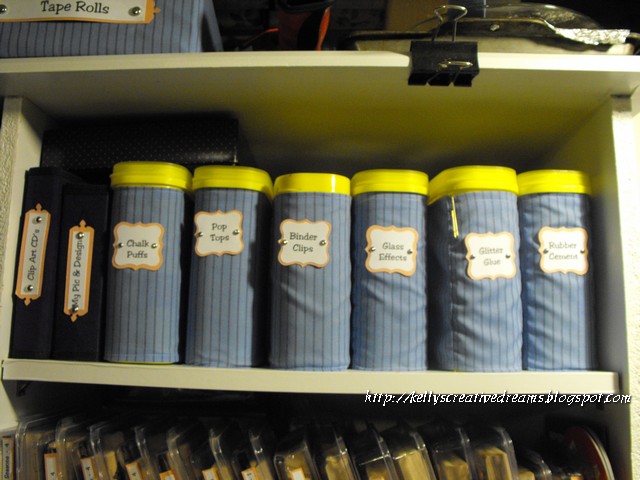
I have one for Binder clips, Pom Pom balls (great for applying chalks/ inks), pop can tabs, glitter glue bottles (not my stickles –they’re special) and just about anything else.
The key is to make sure to LABEL them. Because you can't see through them like a glass container. But if you have everything labeled, it’s still easy to find.
So that’s my tip for this week. With winter coming on, Nestle Quick should be in everyone’s cabinet. It contains 25% less sugar than other leading brands (except Ovaltine hehe). And it makes a great fluffy coffee base!
Creative Blessings!
Tuesday, September 4, 2012
Teapot Tuesday - and a Sneak Peek!
This week our cards are going to Brenda in PA. She and her son were on their way to the grocery store when they were struck head on by another car. Her son was not hurt but Brenda didn’t fair as well. For awhile, they did not believe she would survive. But her faith and determination are pulling her through. It will be some time before she’s able to go home. We all know how depressing hospital rooms can be so we’re out to fill her room with flowers and butterflies – two of Brenda’s favorite things.
My card for Brenda actually gives you a sneak peak at Thursday’s technique… you know, the one you were supposed to get last week LOL. Though I did just notice I"ll need to change the sentiment LOL Why was I thinking Birthday! Oh well, easy fix before it gets mailed.

I won’t go into details about the design so I don’t give anything away. I did choose to stick with a blue/ white/ yellow theme. I mounted the image on SU Bashful Blue. I added a strip of yellow grosgrain ribbon and 3 daisies from a daisy ribbon trim. The yellow seemed like the perfect choice to let the sentiment stand out so I stamped SU Vintage Labels on white, with Daffodil Delight and matted it with Daffodil Delight CS. The butterfly is from the Studio 112 line by Spotted Canary.
So have you figured out the mat yet? Hehe See you tomorrow with something cool to do with Nestle Quick containers.
Creative Blessings!
Monday, September 3, 2012
Magazine Monday - Spider Greetings!
As promised, this week we revisit Halloween with a greeting from a trio of spiders.
I was inspired by a card in the Fall 2011 issue of Paper Creations magazine- page 54. Halloween Spiders was one of three cards designed by artist AJ Otto. When I saw AJ’s trio of spiders, I knew I had the perfect stamp to play with. However, AJ used a flat background then layered the green and purple strips. The purple was cut/ punched to look like a scalloped eyelet trim. A fine orange chord was the fiber of choice.

I wanted to expand on the ‘spider’ theme. I found the Spiderweb embossing folder (similar to the Sizzix one) from Darice at the convention last month. I chose it to add some texture to the expanse of white. The spiders didn’t stamp completely on embossed edges so I just touched them up with a black flair pen. I used the MS spider web border punch to continue the theme in the purple stripe. The black fiber yarn with a bit of silver filament running through it seemed to be the perfect choice to bring it all together.
I chose the ‘web-encased’ Halloween sentiment from a set I picked up at Big Lots.
Next week… we’ll stick with the Halloween theme but bring in a bit of vintage.
Creative Blessings!
Sunday, September 2, 2012
A Sweethaven Challenge
Last week I linked you to the Sweethaven blog by author Courtney Walsh. Courtney has an awesome challenge for us to create some type of layout in the media of our choice that reflects something from the Sweethaven series. The details of the challenge and list of prizes can be found HERE.
Here's what I came up with:

The Sweethaven series is about friendships. Though separated for many years, there are some bonds that can not be broken. You truly are friends for life. Friends, like soulmates are as the quote says... 'A true soulmate is a mirror. The person who shows you everything that is holding you back... The person who brings you to your own attention so you can change your life." ~ Elizabeth Gilbert
Soulmates doesn't have to mean a lover or husband, though they can be. They are the person who we really connect with on a much deeper level.
The base was created on a piece of canvas board. I applied a layer of white gesso, then got out the paint! I chose FolkArt Red Violet, and Sweetheart Pink. I put 3 or 4 quarter-sized drops of each color in various places on the canvas then spread it around with my fingers. LOVE the feel of paint. While it was still wet, I used the swirls and heart wheel from Stampin Up to run a little texture on the one side. The papers are from DCWV Once Upon A Time (My FAVORITE DCWV slab) and a piece of lavender paper from my scrap drawer. I tore the edges then inked them up a bit.
I printed the quote on vellum then sprayed it with a clear fixative and let it dry over night. Then I tore and distressed the edges a bit. The edges refuse to lay down. They only curled up worse when I tried to put a gel medium wash over the whole thing. So I'm letting them curl, giving the whole thing a bit of texture.
The metal tag in the bottom corner is from K & Co. It says 'Together is a wonderful place to be'. I balanced it with a copper and wire heart I'd stitched several years ago. The stash drawer is a wonderful place to play! The tags down either side say SOUL and MATE and are anchored with Ranger Stickles in deep purple.
Win or lose, I enjoyed creating my very first full piece of mixed media art. Now to figure out where to display it! LOL
Creative Blessings!
Tuesday, August 28, 2012
TeaPot Tuesday - Strawberry Milkshakes!
Today's card actually goes to an 11-year-old boy by the name of Tyler. You can read the teapotter story here. Tyler's medical problems began in 2002. To say the least, it has been a very long journey for someone so young. His full story can be found on his website. He is a typical little boy. He has his favorite characters, is as active as his health allows, likes jokes and strawberry milkshakes.
Part of our challenge was to incorporate a joke... the opening being on the front of the card with the punch line being inside. Oh yeah, and bring plenty of strawberry milkshakes.
I had a cow stamp from the $1 bin at Michaels. I'm not a cow person but it's one of those stamps everyone should own because someone, somewhere likes cows. LOL I also has a four seasons faerie stamp set from Sarah Williams stamp line. One of those wonderful freebies when you purchase the UK magazine. LOVE those! Anyway, the spring faerie was all about strawberries, complete with a vine of the scrumptious treats. So here's what I came up with for the front of the card...


I can't wait to see who we get to send to next week!
If you are not a TeaPotter but would like to play, just click on the button that says I Survived TeaPot Tuesday. It will take you to the SCS Teapot thread list where you can get all the details. Help spread the cheer!
Creative Blessings!
Kelly
Part of our challenge was to incorporate a joke... the opening being on the front of the card with the punch line being inside. Oh yeah, and bring plenty of strawberry milkshakes.
I had a cow stamp from the $1 bin at Michaels. I'm not a cow person but it's one of those stamps everyone should own because someone, somewhere likes cows. LOL I also has a four seasons faerie stamp set from Sarah Williams stamp line. One of those wonderful freebies when you purchase the UK magazine. LOVE those! Anyway, the spring faerie was all about strawberries, complete with a vine of the scrumptious treats. So here's what I came up with for the front of the card...

Do you know?

I can't wait to see who we get to send to next week!
If you are not a TeaPotter but would like to play, just click on the button that says I Survived TeaPot Tuesday. It will take you to the SCS Teapot thread list where you can get all the details. Help spread the cheer!
Creative Blessings!
Kelly
Monday, August 27, 2012
A Sneak Peek and a Give Away
Later this week I'll be showing you my entry in a Creative Challenge at the Telling Stories blog. But today I want to give you the opportunity to win one of Courtney Walsh's books. You get to choose which of her books you'd like to have.
PLUS Studio Calico is giving away one of their September scrapbooking kits! Wowzers. Courtney has a few ways you can rack up your chances of winning so scoot on over to Telling Stories and say Hi.
Magazine Monday - Halloween
I seem to be in a Halloween mood lately. I found several cards of inspiration in the Fall 2011 issue of Paper Creations. I’ll be sharing my take on them over the next few weeks.
Today’s card was inspired by Trick or Treat by Jenny Gropp. (pg 62) Jenny chose to use a 5” square card. She matted a striped patterned paper in gray/ white/orange/ black print against a black mat. She used a white pen to create a running stitch line around the edge of the black mat to ‘enhance’ the frame effect.
Here layered ‘diamonds’ in an orange plaid and a gray print were matted on black. She then ‘top stitched’ the prints with a black pen. She used the same prints to stamp Trick or Treat tabs.
Her shoes image (Outlines Rubber Stamps) was stamped on white CS, matted on a the orange plaid then again on black. She anchored everything with a black/ orange plaid ribbon.

I like working with what I have. I just bought these shoes as part of a Studio G Halloween stamp set. The set also included a hat and a crow. I stamped the shoes on white CS with Memento Black then colored in the stripes with LePlume yellow-green. The Trick or Treat is part of a 4-pack $1 from Micheals.
My background mat is from All My Memories. The other papers were all from a misc. slab I bought at Michaels years ago. The green and purple CS are from ValuCS packs. I used an EK Success corner punch for my mat. The ribbon is one of the new ribbons from Studio G Halloween collection. I cut it in half lengthwise to make it more narrow.
The only thing I wished I’d done differently was to mat the striped paper against black CS to help pick up the black mat in the center.
Next Monday… Spiders pay us a visit and I’ve used one of the embossing folders I picked up at convention.
Creative Blessings!
Wednesday, August 22, 2012
Recycle Wednesday
For today’s recycle I’m pulling out something I’ve been using for about 5 years. My marker holder.

This is full of all my LePlume markers, Permenant Markers, a few Copics and glitter markers…
Markers should be stored horizontally. In the issue of space we sometimes forget and just stick them in an upright pencil holder or similar on our work surface. I designed this holder when I was first creating all the storage and whatnot for the then new office/ studio space.
I found these 16 oz glasses at Menards. I believe they came cellophaned together 3 for a $1. I bought 2 sets. These are blue whereas the ones I used in the project are clear.

With the help of a little E6000 glue, I put them together in a pyramid. I wrapped them tight with a rubberband and let the glue rest overnight. This is what it looks like empty…

Creative Blessings
Kelly
Tuesday, August 21, 2012
Teapot Tuesday
Good morning, Everyone
A head cold has hit full force and don't feel up to creating today. I do want to do the card for Tyler. We're supposed to create a joke on the outside and the punch line on the inside. He loves Strawberry milkshakes. I have the beginnings of the card in my head... which at this point is really scary. So hopefully later in the week I can make it come together and share with you.
In the mean time, please read Tyler's story and consider joining us in sending him some funny love!
http://www.splitcoaststampers.com/forums/19627038-post310.html
Monday, August 20, 2012
Magazine Monday
With the cooler temperatures the past week, it's been easy to get into a FALL frame of mind. It feels like fall so much I'm in 'fall cleaning' mode around here. Not good when I have so many projects I want to get done. Like this card inspired by Jacki Jones. I'd love to find a blog or website for Jacki. The only thing my search brought up was a profile of her on Hero Arts. Her card - Natural Gift WRap Khad White - was featured in the May/June 2007 issue of rubberstamper (Yes, I'm about through showcasing artists in this issue lol)
She repeatedly stamped the Skeleton Leaves onto the gift wrap with CTMH's Autumn Terracotta, SU's Close to Cocoa, Ranger's Adirondack Earthtone Raisin, Tsukineko's Versam Magic Mango Madness and Brilliance Galaxy Gold. Wow! You gotta love a gal not afraid to mix her brands! She cut out 2 leaves, where

I only did one and tucked them behind 5/8" brown grosgrain ribbon. My card is pretty much the same as Jacki's but I added the little tag attached to the ribbon with a gold jump ring. I used SU Dusty Durango, Pear Pizzaz as my paper layers. The leaves are stamped in SU Cajun Craze, Close to Cocoa, Really Rust, and Apricot Appeal. The ribbon is SU Pear Pizzaz seam binding.
Thursday, August 16, 2012
Technique Series #3- Mono Printing!
Today we’re talking Mono Printing. Mono Printing is similar to letterpress except you use a die cut as opposed to an embossed image to take your impression from.
This is one of those projects where I should have warned you ahead of time. A good thing to have on hand if you’re playing with ink or paints is a piece of Plexiglass. You might even want a couple of different sizes. The one I used for this was 6.5”x7”. You can get them at most any hardware or lumberyard and they aren’t expensive. I have another one about 4”x6” and paid less than $5 for the two of them. Keep in mind the size of card front you work with most and go at least an inch bigger.
Aside from a piece of Plexiglass you’ll need:
2 colors of acrylic paint
A mister bottle
A brayer
Diecuts
Card stock (cut the piece a bit larger than what you plan to use it for.
Baby wipes or paper towels
Think what you want your background color to be vs. the image. I chose SU Almost Amethyst for my ‘sky’ background. Put a good-sized dollop or straight line or paint horizontal across the glass. Brayer it out to cover the glass then mist lightly with water.

Lay your die cut shape on a sheet of paper or craft mat. Craft paper, reused printer copies or butcher papers make great work surfaces for this.
Brayer your alternate color (I used green) and brayer the die cut shapes. Then mist lightly with water. Be careful not to ‘saturate’ the paint as the paint will run and you’ll lose the details of your image. You want just enough to thin it out a bit.
Turn your diecut, paint side down, onto the Plexiglass. Mist the entire area again with water. Then place a sheet of cardstock on top of the glass and gently rub your hand over it to transfer the image. Don’t ‘push’ as this might make your die cut slide.
Carefully lift the cardstock off the Plexiglass and set aside to dry completely. If it wants to curl let it dry completely then you can press it between a couple of books overnight or with a warm iron. (Yep I own two – one just for crafts LOL)

Vicki stresses this one might take a little practice until you get a feel for the paint to water ratio and the pressure of you hand. But the after effects can be beautiful.

This tree card looks a bit childish but my granddaughter will love it. One more Christmas card done! I used the Sizzix mini-ornaments for the bulbs/ lights/ star, adding gold and silver paint pen for adornment and a glitter pen for the light chord. The stamp is from SU – Holiday Best stamped in SU Marina Mist.
Remember to check out Vicki's blog for great inspiration and pick up her book so you'll have full instructions and bonus tips for all 40 background techniques!
There isn't going to be a scrapbooking post tomorrow. I'm in St Louis at a stamp convention/ writers retreat. I'll see you all on Monday!
Creative Blessings
Kelly
Wednesday, August 15, 2012
Recycle Wednesday
I'm not sure you'd really call this a 'recycle'. The only thing I've 'repurposed' is the 2x2 Bob had in the shop. We purchased the 1.25 inch PVC. But those two items are providing a ton of Stickle Storage!


I saw something similar in a magazine that could be purchased. Well, you know me, if it can be made I'm going that route. LOL We started with a 5' length of 2x2 pine board. Then using a keyhole bit we routered out a well about 1/4 inch deep for the PVC to nest in. Then we cut the PVC 2.25 inches and pushed one down into each hole. They are not glued in... they fit snug just worked in. When you turn the Stickles bottles upside down, you get about a 1/2 inch of the bottom of the bottle showing, allowing you to see the color and have room to get a hold of it.
If I remember correctly, there are 27 tubes for Stickles. I have added a couple basic colors of acryclic paint. Because this sits flush against the utility cubbies, I had to take the pliers out of the cubbies (the handles were in the way of the stickles holder) and have put them as well as my punches in some of the empty holes.
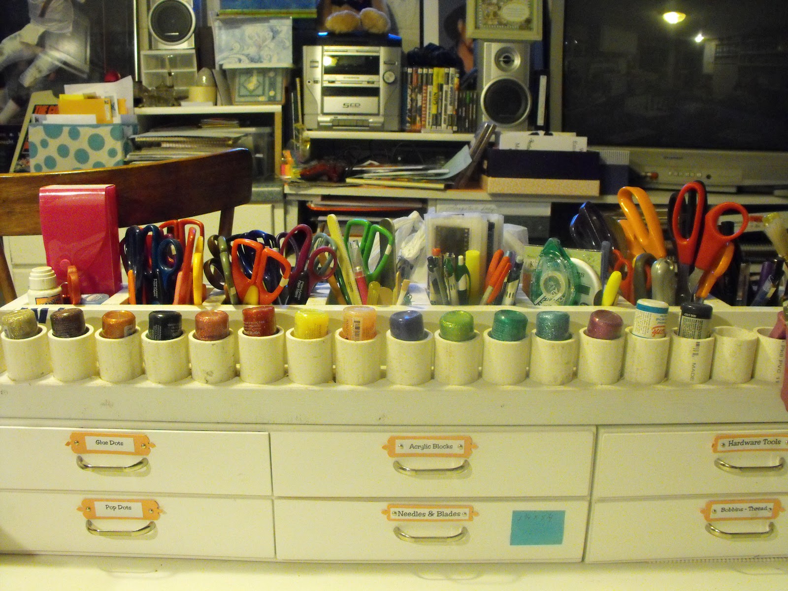

I'm hoping with the colors out in front of me all the time, I'll think to use them more often. I have a rack of 6 basic colors for the mixed media table, too. I'm think when I get the Studio and begin decorating, I'll paint and wrap the tubes for a little color but for now the plain PVC tone will work.
Creative Blessings!
Kelly
Tuesday, August 14, 2012
TeaPotTuesday for James
Nothing breaks my heart more than knowing something small is hurting in a big way. This week's TPT is all about bring smiles to a courageous little boy named James. You can read the TeaPot story HERE. Although the post has a link to his Caring Bridge page, I'm including it here as well where you can go directly to read about the struggle 3-year-old James is facing.

James loves Pirates and Puppies. Yep, he's all boy. I had purchased some pirate images from Bad Axe Trading (out of business) several years ago. The two things I didn't have was a pirate ship and a puppy so I turned to my trusty PrintShop program for both. I cut each of the wave sections separately and layered them so I could tuck the ship among them.

Please offer up prayers for this precious little boy that he may grow up to be a pirate someday!
Creative Blessings
~Kelly
Monday, August 13, 2012
Magazine Monday!
Happy Monday, everyone!
My in-laws left this morning after a weeklong visit that included a short road trip to meet up with our daughter and her family. The gathering brought four generations together for an overnight stay in Paducah, providing lots of time for just visiting and letting ‘Grandma Great’ and Grandpa Dick spend sometime with two little ones they don’t get to see as much as they do the other grand and great grand kids. This was the first time they got to see Abby (born last Oct.) and meet our daughter’s fiancée. It was a good time, but I’m happy to be back to work.
Today’s Magazine Monday card comes from the 2007 issue of Rubber Stamps. Anna Justice created a graduation card using CTMH and The Stamping Studio products. She revisited the technique of stamping an all-over image on solid cardstock to create our own DP. She used Congratulations in various fonts to make a graduation card.
My pic didn't turn out very good today. I had to shoot it inside because the wind is blowing like crazy! I think one of my next projects is a photo box. For now, let's see how this card came to be.

The ribbon is a newbie I picked up at Hobby Lobby last weekend. It’s not a ‘stiff’ ribbon, but it’s isn’t light weight flimsy either. It was easy to run the Tombo across and would have fed into the Xyron very easily. I raided my Halloween embellishment tub for fibers and the embellishment drawer for buttons and brads.
Best Witches!
Wednesday, August 8, 2012
Two Great Books!
I'm jumping in with an additional post this morning to introduce you to two blogs I'd love for you to check out. This might sound a bit confusing, but hang with me and read carefully. You only have a day or two to take advantage of this.
One is Creative Foundations author, Vicki Boutin. Vicki is good friends with Courtney Walsh, who is also a scrapbooker and wonderful author. Friends support one another so they've teamed up to give us a chance to WIN a couple of books.
Go to Vicki Boutin's blog post HERE for a chance to win a free autographed copy of Courtney's latest fiction release, A Sweethaven Homecoming. This book is part of a 3-book series that all have scrapbooking at their core. Vicki has a question on her post you need to answer by leaving a comment for your chance to win.
But wait... there's more! Vicki is actually drawing TWO names on Thursday. Not only is she giving away the copy of A Sweethaven Homecoming, but she's also giving away a copy of Courtney's scrapbooking eBook - Step Up Your Supplies!
When you've left your comment there, go over to Courtney's blog post HERE for a chance to win an autographed copy of Vicki Boutin's book, Creative Foundations, which I've talked about on here. Courtney is giving you multiple chances at winning Creative Foundations. Leave a comment on her blog, plus if you tweet, FB, blog, etc about the book, go back to her blog and leave a post for each one. The more you spread the word, the more chances you have to win your very own copy of Creative Foundations! How cool is that!
Good luck and Creative Blessings!
Kelly
Recycle Wednesday
I started this project last week but just could't get the time to finish it until this morning. I rearranged an entire bookcase unit to accommodate my excess mixed media toys - you know the ones that wouldn't fit in that rolling bag I bought earlier this year. I wanted to have the items I used frequently at my finger tips, not stashed in the bag.
In looking at the May/June issue of Paper Crafts magazine, a storage idea caught my eye... something they would be showing in their special publication Practical Solutions. If you can get a copy, look on page 34 - Found Objects for Mother's Day. They took a variety of empty cans and turned them into a decorative storage unit for your desktop.
So here's what I started with:
I spray painted them all white. I didn't want the traditional colors I'll be using in the studio. I wanted something more about the 'artsy' side of me. Well... I picked up on my witchy colors and came up with this:

I left approximately a 1/4" of the white showing above and below the edge of the base of the deep wine ValuCardstock. Then I reached for the folder containing homemade papers. The green layer is almost tissue paper weight with a bit of leaf pattern through it. Then I added the heavier orange/ purple/ silver handmade papers.I adhered each layer with ModgePodge. The can in the far back (hard to see) and each of the two cans flanking it (fabric markers and smaller brushes) are glued to another inverted can with E6000 to stagger the levels.
Now I have my large OneStroke burshes in one can - great for spreading modge podge or gel medium, a can for a variety of smaller brushes, one for fabric markers, another for a variety of texturing tools and one for pallet knives. I'm not sure what I'll use the tuna can in the very front but it helps fill the space. They are not glued to the lazy susan but appear to be stable.
Next week I'll have a storage solution I designed based on a sample I saw on-line. I saw a storage unit for Stickles and decided I could make one of those. Well, like most of my projects - though I could make it - I design it and hubby builds it. Can't wait to show you!
Creative Blessings!
Subscribe to:
Posts (Atom)