Showing posts with label DCWV. Show all posts

Tuesday, July 14, 2020

CARD CHICKS - Fairies

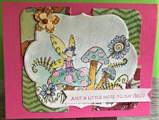
Today, I'm showing off the card kit from the June Card Chicks. Suzy sent a great kit for the month. She featured a Fairy image  called 'Mini Fairy Ring' from Outlines Rubber Stamp Co. (now closed)


The month of June features the Summer Solstice... a time when the veil is thinnest between the human world and the Fae world.

The DSP Suzy included came from DCWV and paired well with the Texutre Brights paper pad I had from the same company. Here's the supply run-down:

Memento Tuxedo Black, Granny Apple Green, SU Watercolors

DCWV Brights Textured Core, Whisper White

Dies, SU Triple Banner Punch, Crafters Square bling

 Flowers – SU punch from paper collection, brads from Paper Studio


I used a variety of SU Watercolor Pencils to color the image. All the trims were included in the kit. 

Monday, April 7, 2014

MIXED MEDIA MONDAY - Shopping!


Look at all my goodies! And the best part - 50% OFF!!!

This was a true find. I was not looking to pick up any Project Life items. My plan for PL was to use some of the cool freebie printables from ScrappyStickyMess and others on-line as well as designing my own. But when I rounded the isle of Hobby Lobby yesterday and saw several kits marked down by 50% I HAD to look. This is a collection between two HL stores in Springfield MO. The kits had all just been marked down that afternoon so word had not spread and I had plenty to choose from.

I bought 4 of these 40-pk bags and 4 or 5 of the smaller Memos packages. The little stamps are shrink-wrapped 2 to a package for $1 from Michaels. Perfect for Project Life

This shows more of the pads as well as a Albums kit in the background. The colors just screamed Adrian and Abby so had to grab. The hair clips are great for the PL albums or as bookmarks. They were in the $1 tower bins at Michaels.  Oh.. the frame off in the upper right corner - I got to use as a stencil - spraying through for art journals. Michaels also had DCWV Slabs for $5. I found one that fits the Victorian color-theme of my Documented Life Planner. So yeah, was a good score all the way around this weekend. Now to get it put away LOL


Tuesday, July 16, 2013

WELCOMING BABY! - Shabby Chic 1st Year Album


I finally got to make time last week to play. And I had so much fun creating this shabby chic album for my niece, Cheyanne. I've never worked in shabby chic before so this was fun to play with. I should have done an 8x8 but I am happy with how the 6x6 turned out.

This album was originally brown. I removed the plastic cover, took the posts out allowing me to dismantle the album. I used hot glue to adhere the unbleached canvas to the front and back covers and wonder-under for the spine piece. I did the inside covers with April Lovely cardstock by Core'dinations. If you've not used this cardstock before, it has a beautiful canvas texture. I chose April Lovely, Mystic Gray (which actually has a sage green tone to it) and Picket Fence. I found them at JoAnns Fabric and Crafts.

I raided my vintage lace and trim sewing tub for soft textures. The cover has 2 different layers of lace plus a strip of white/ pink daisy ribbon from The Paper Studio. All of the flowers are from Recollections except for the antiqued one in the center. That is made from 6 scallop layers punched from book pages and inked with SU Caramel. The baby buggy is made from 1 and 1/4  scallop circles punched from SU Pretty in Pink and GP White. You will find the directions HERE. I added the mini flower punch 'spokes'.

One of the embellishments I used throughout the album was the mini butterfly punch from SU. I punched some from GP white, and some from DCWV Shimmer Matstack. Some of the white ones I brushed with ink or stickles, others I left plain. For the body I used Recollections teardrops or The Paper Studio gemstones. The pink ribbon is pink grosgrain from Paper Studio bobbin.


The inside cover is stamped with an Innie Outie stamp in SU Regal Rose. I've layered the stamped GP white mat on a sheet from DCWV Garden Party. I loved the hints of the pink tones I had in the Recollections flowers. Then these were layered onto the Mystic Gray.


Here is a sample of a 2 page layout. There is a spread for each of the first 12 months of little Libby Ann's life. I used the Picket Fence for all of the 6x6 bases. The titles are printed on GP white using the MEANINGFUL font. You can download it free HERE. Each title mat was layered onto the April Lovely then Mystic Gray.

The journaling box is corner punched with an EK Success decorative corners - Lace. The pink ribbon decorative strip is layered with a soft green print from the DCWV Garden Party slab.  On the facing page, I brought in some of the vintage lace (no, that isn't paper). The photo mat is large enough to accommodate a 3x5 photo... just the right size for a 1st year picture. The concept is to see the subtle changes the child goes through from month to month that we often don't see as they occur. The only embellishments I used were the flowers from Recollections (there were 3 each of 3 color tones in the package) and the butterflies.


I know Cheyanne liked the album and I loved having the opportunity to give her a head start on documenting little Libby Ann's life. Of course, her grandma (my SIL, Kelly Sue) has a new camera and has been taking tons of pics of the mommy-to-be and is a paper crafter so I know there are more albums in their future.

Tomorrow is WOYWW. Are you sure you want to see the mess I left in the wake of this album as we headed out the door to OK last weekend? Come back and see me. I'll show you what I bought while we were there.

Creative Blessings!
Kelly

Wednesday, March 6, 2013

WONDERING BLOG - DCWV Challenge

I LOVE DP! Some of my favorite DP slabs come from Die Cuts With A View. So when I found their blog I was thrilled to bits of paper.

Every month, DCWV Diary  have a layout challenge. Usually there is one for Scrapbook and one for a Card. Although I've not had the opportunity to play yet, I try to remember to check them out every month for layout ideas.

This month's scrapbook challenge, as you'll see when you follow the link in the above paragraph, uses things in sets of two. They have used Valerie Salmon sketches before. She is so creative.

2 TAGS
2 PHOTOS
2 STRIPS

The card is all about Pennant BANNERS as your focal point.

I can't wait to play with these but it will be at least another week before I have things back in place and can play again.

In the mean time, hop on over to the DCWV Diary blog and see what you can come up with!

Creative Blessings
Kelly

Monday, October 1, 2012

Magazine Monday - Circles & Scraps

Happy Monday Y'all!

Yes, I'm a bit late. Instead of playing with paper and ink yesterday, I scrubbed my kitchen floor and washed all the rugs. Glamorous life we lead, isn't it. ::: smile ::: But my floor looks awesome.So today is my usual Monday business AND squeezing in some play time.

Today's inspiration card is by designer Charlene Austin. If you click on her name, it will take you to her blog. If you click on this - Paper Creations, it will take you to a profile they did when they featured her as a guest artist. To top it off, if you click on Splitcoast - it will take you to her gallery where you can see tons of her creativity in one place. Pretty neat gal!

Charlene's card was a Birthday card with a bright turquoise bow from Creative Impressions. She used 5 rows of 5 circles on her card. I had mine going a bit closer together and wound up with 6 circles and only 4 rows.

A dear friend of mine is going through some medical issues and life changes, including a new condo. So I thought I'd go with the fall colors and send him a card just to let him know I'm thinking of him.


I kind of revisited the scrap drawer again with this card. I store my slabs in the 3/4 in paper keepers from Cropper Hopper. They line up nicely on the center shelf of my entertainment center-turned - scrapbook cabinet. I have all the spines labeled so I can go right to the season/ category I need to work with. About 98% of my slabs are Die Cuts With A View  aka DCWV. Did you know they also produce the Recollections slabs? Same great quality just a different label. Cool, huh?

Anyway, I store all the scraps from that slab in the paper keeper so if I just need a little something for a tab or mat, I don't have to cut into a big piece but I still know where it came from. So THOSE are the pieces I went to. All but the paint splattered looking circles came from a slab put out by Walmart called HARVEST. yeah, I know, it's WM, but they do have some pretty papers and this set I picked up at a garage sale for $1. Only a couple of pieces had been removed. I love deals!

I used SU- Chocolate Chip for the base mats and the ribbon/ bow, Very Vanilla and More Mustard. The little leaf brad is from Creative Impressions and the mats and circles were cut using the Cricut Accent Essentials cart.

Off to check out the details for tomorrow's card!
Creative Blessings!


Monday, August 6, 2012

Magazine Monday

Squeaking in under the wire tonight.


This week’s Magazine Monday challenge comes from the May/June 2012 issue of Paper Crafts Magazine. They showcased a Designer Challenge of creating a Feminine and a Masculine card using the same product. I knew I wanted to use DCWV Once Upon A Time. I fell I love with this slab when it was first introduced about six years ago. With a mixture of lights and darks, burgundies and deep purples with a mix of fairies and dragons, I knew this would be an easy challenge.


I paired the DCWV papers with SU Very Vanilla. For the feminine card, I also added SU Cherry Cobbler. With a few antique pearls and a rich double-layer flower, a bit of vintage lace and decorative ribbon is all I needed to pull everything together. I used the SU Vintage Labels for the sentiment.

The guy card came together just as well. I have very few ‘guy’ images. (I can work on fixing that problem when I go to the convention in a couple weeks) But with the blues in mind, I flipped through my binder of UMs to the Coastal/ Maritime collection by InkaDinkaDo. I chose the small sail boat and a sentiment from what I believe may be a Gina K designs collection. I created a pendant flag to stamp the sentiment on. The backgrounds of both mats was inked with SU Baja Breeze.


 I then stamped both the image and the sentiment by first inking the stamps with Baja Breeze then over-inking with Perfect Plum. The ribbon is from Michaels.

This one I’m going to sneak into my husband’s suitcase when he goes back out on the boat in a couple weeks. He knows I made him a card but I told him he never knows where it will show up. I’m ornery like that.

Monday, March 26, 2012

Magazine Monday


Things are going to get crazy the next couple of weeks. We're going to Nashville to pick up Adrian on Friday. She'll be here the next 2 Mondays. I'm working hard today to type up the posts so I can still share some pieces with you.

I made good use of the VSN challenges earlier this month. One of the challenges was to create a Sympathy card. We don't like to think of ever having to need them but they are a part of life. I just keep reminding myself this is my way of hopefully giving comfort to someone in great pain.

I chose a design by Keri Lee Sereika in the Oct. 2009 issue of Crafts 'n Things magazine.
She showcased three beautiful cards inspired by supplies she had on hand. That's what I encourage the S2S group on SCS to do all the time. Don't buy more until you've made use of what you have. And if you are going to buy new, will you really use it? Or will it be added to the stash of 'someday' projects?

Keri used a lighthouse stamp from Scene It! Beacon of Hope by Cornish Heritage Farms Her card, entitled Never give up hope used a beautiful lavender-swirl paisley paper and a plum cardstock from Prism Papers.


Following Keri's concept of 'use what you have', I went to my DCWV Old World slab. I chose the blue nautical print and paired it with SU Marina Mist. For my image, I chose the Garden Collage from SU and stamped it in Marina Mist. Two pearls seemed like the perfect accent with this image and sentiment.

This was a simple layout but sometimes, simple is the best and when you need a card last minute, it's nice to know beauty and simplicity can pair nicely to bring comfort to someone else.

I have no clue what was up with my camera that day but regardless of what I did, I couldn't get a decent photo of any card. Some days are like that and we just roll with them :-)

Wednesday, March 14, 2012

What's On My Mind Wednesday

Okay... it's not Recycle Wednesday, but it sounded good. hehe

I took yesterday off to go into the city for the day. A long day which began with getting on the road by 8 a.m. and pulling back into my driveway a bit before 10 p.m. It was a relaxing day. I did some snooping, some shopping, enjoyed lunch with my sister and browsed mixed-media books at Barnes & Noble.

I started off heading for Ava, MO. Remember the blog hop I went on last fall? Dogwood Quilting is where I won the $50 gift certificate. I knew I wanted the solid cotton fabric for the sashing and backing for the butterfly quilt made from reproduction fabrics. We couldn't find a thing that worked! She had very limited supply of the solid cottons. Connie said she seldom has a request for them. Okay... plan B. I see a book for projects using the paint sticks. I've been wanting these but not enough to spend $35+ plus for a 5-pack. Guess what? They were sold out. So much for Plan B.

I did manage to find two quilting books I couldn't live without. One was the Pioneer Sampler by Eleanor Burns. I've recorded the series off of RFD-TV but wanted the book for a more detailed cutting instruction. I also picked up Burgoyne Surrounded - A Classic Quilt Plus Six Variations by Elizabeth Hamby Carlson.

Once I got to Springfield, I went to Hobby Lobby, Michaels and JoAnns. I found the perfect fabric for the sashing/ backing. I thought it was on sale. Turned out it wasn't, but it was a better price than I'd have found in another quilt store and exactly the color I wanted... a pale mint green. I also took advantage of paper being on sale. Slabs and individual sheets were 40% off and I had a coupon for an additional 20% off. I was disappointed they only had a couple of the new DCWV slabs in... and not the ones I wanted. I did buy a solid slab to use with one of my others for a DCWV scrapbook layout competition I'm hoping to enter this month. It dawned on me I probably didn't want to use SU cardstock for the layout hehe.

At Hobby Lobby, I picked up a package of the CB border folders with a coupon and they had the Paper Studio ribbon spools 50% off. Yeah, had to pick up 10 of those :-) You know, like I needed more ribbon! I've wavered back and forth about the CB border folders until I saw a card recently where the border folder was used to create a separate mat - not for embossing the edge of the card. It was one of those DUH! moments for me.

I didn't find a single thing at Michaels. That store was a disaster! They didn't have hardly any Easter crafting supplies and I really wanted paper mache eggs to do a project with Adrian while she's here. What 4-year - old doesn't like to tear paper and glue! The $1 tower baskets along the front of the store were empty and they didn't have a single new slab of the DCWV. I was so frustrated, I didn't even bother going back to the art department. I do know that for all the 'bad scores' the Peoria Michaels store ever got, our store NEVER looked like this one. I'm not even sure it's worth going back. I can always use an overnight in Paducah where the store is clean, well stocked and friendly staff.

After early dinner at Red Lobster for Lobsterfest with my sissy, I spent an enjoyable hour at Barnes and Noble browsing mixed media books. There were several new ones but I came home with only a Texas magazine and a wood tick! Yep, a tick. Thank you B & N!

I have a bunch of writing stuff due over the next couple weeks so I'm going to force myself out of the studio to get those projects out of the way. So for the next couple of weeks, probably the only posts will be the Magazine Monday. But I'll pop in to keep you updated on progress.

Creative Blessings!

Tuesday, March 6, 2012

Teapot Tuesday!


Today we are taking the royal carriage to Austin TX and the home of Virginia Blakley. Virginia recently broke the femur bone just below her hip. Not fun! Virginia loves history and has read everything on Queen Elizabeth. So our challenge for TPT this week was to bring a touch of royalty and books to Virginia. As a bonus, she loves cats but can't have one because her husband is allergic. So if we included a royal feline, all the better!

Virginia is also uber special because she is the mother of one of the kindest souls on SplitcoastStampers. Lydia, aka Understandblue, is one of the forum mods and is usually right on top of fixing any problems we might have or directing us when we're not sure we've done something correctly. Though she is not the only mod over there, she is the one I work with most often and adore her.

You can read Virginia's story in it's entirety HERE

As soon as I read the challenge details, I knew I had to use my DCWV Once Upon A Time stack. The colors and the theme were perfect for this challenge.


I paired the paper with SU Bravo Burgandy and Very Vanilla. The cat is from Paper Crafts. I inked the stamp with Memento Tuxedo Black and then over-inked it slightly with SU Bravo Burgandy. I can't remember the stamp company I got the book stamp from. I used MTB to stamp over a section of the 'story' paper in the DCWV slab then cut it out. To break up the pairing of DP/ solid CS, I used a strip of SU Elegant Eggplant to pull out the script from the DP. Then I found this rich -looking gold trim in my fiber stash. Perfect!

To finish it off, I cut the crown from a background sheet of the same CWV slab and added jewels to the crown points. I cut a slit and so Her Royal Kitty could wear her crown properly.

I hope Virginia enjoys this card as much as I did creating it for her.
Speedy Healing, Virgina and...

Creative Blessings to all!

Thursday, March 1, 2012

DCWV

By now ya'll know my absolute favorite DP to work with is DCWV. Their paper slabs are so rich, well-coordinated themes you just can't help but flip through a slab while your creative brains spins wildly with the unlimited possibilities.

Last week I discovered their blog, DCWV Diary. WOW! They have been featuring the new slabs in both their namesake - DCWV slabs and their 'undercover' line, RECOLLECTIONS (found at Michaels). Today marks the release of their AWESOME spring slabs hitting Michaels shelves. Check out THIS YouTube video to see them up close. My favorite is the Garden Tea Party.
It will be another 2 weeks before I can see them in person but between JoAnns and Michaels, it's going to be a DP buying weekend! LOL

Today's post on their blog showcases the Top 10 of their February Sketch Challenge, as well as revealing the winner. I love the diversity of the take on the sketch. Incidently, they got their sketch from Sketch Savvy This is the 2nd time TODAY, I've been directed to Susan's blog so I had to check it out. She has some great stuff over there. Lots of cool inspiration. I hope you take a couple minutes to check it out while you're cruising.

Creative Blessings!

Monday, January 30, 2012

Magazine Monday

Good afternoon!
The weather here today was gorgeous, so instead of going down into the 'dungeon' studio, I got outside. When I did come back in to play, I found two challenges which I could use on today's Magazine Monday.

1) I knew I wanted to use one of the images from Sandie Huggett over at The Outlawz Creative Freebie Challenge. I never seem to get my cards in over there in time. I'm surprised they still let me play.

2) S2S12C - The Stamp 2 Spend Challenge at Splitcoast Stampers - Use our favorite pizza as inspiration - and make it round. I'm a garbage pizza person. You'll notice I've picked up the green pepper colors in her socks, Italian sausage on in her shoes color and her dress the color of warm tomato sauce swirled with melted Mozzarella. Her hair also brings in the extra cheese.

3) While cruising for a magazine with an inspiration card, I found a dreams card in the February 2012 issue of Crafts n Things magazine. It is a design by Sue Czosek. Sue was inspired by a design of a Borders gift card holder. She used it and a sheet of newsprint to create a beautiful round card. Sue's card was a 5.5" circle. I used a 4.5" circle and then a 4" oval mat.

4) And lastly, since Valentine's Day is approaching, I might need one or two more cards to share so I went with the heart theme. Where I have used hearts (Sizzix Sizzlet), Sue punched flowers from news print and inked them to coordinate with her color scheme.


On Sandie's original image, there was a halo above the faerie an where I have the puffy hearts going off to the side off of her hand, they were actually a print part of the image. I chose to cut them away to give a cleaner cut to the main image then added the puffy hearts in their place.

I used SU Real Red CS and DP (inside covers), My Minds Eye Candy Stripe and DCWV - sentiment The image was colored with Derwent watercolor pencils. I added EK Succss puffy heart stickers.

I love how she turned out and I hope you do to.

Monday, January 9, 2012

Magazine Monday

With the head cold working it's way to where ever colds go, I'm back to creating again. I felt so good last night I didn't want to leave the Studio. I created today's card plus cut the base mats and stamped the images for 9 more. Yep 10 more Christmas cards for 2012 will be done by the end of today.

I was inspired with today's card from a member of our Christmas Card Challenge 2012 members. Colleen (Katchoo1 on SCS) showed us her January card using a layout she used back in 2006 in the spring issue of Take Ten. You can see her card HERE. Although I have several back issues of Stampington publications, this was one of only 2 back issues of Take Ten I have in the Studio and am glad it was. WOW!

This LO hits all the marks:
EASY
SIMPLE
CLEAN
USES STASH/ SCRAPS
IMPACT


Here's the recipe:
5x6.5 card (I created mat dimensions for both standard card sizes)
DP scraps from DCWV Christmas 2010
SU Pacific Point CS
SU Pacific Point ink & water color crayon
SU Big On Christmas stamp
Black and Red Perma Marker
Blue snowflake (gift wrapping trim - Walmart)

Dimensions:
5x6.5 card -
Base Mat - Cut 2- 5 1/8 x 1" + Cut 2- 3 5/8x1"
DP - Cut 2 - 5x7/8 + Cut 2- 3.5x 7.8"
Center Mat- Cut 1- 3 7/8x 2.5" (CS) + 1- 3 3/4x 2 7/8" (white)

4.25x5.5 card-
Base Mat- Cut 2- 4x1" + Cut 2- 2 5/8x1"
DP - Cut 2- 3 7/8x 7/8 + Cut 2- 2.5x7/8
Center Mat- Cut 1- 2 7/8x 1.5" + Cut 1- 2 3/4x 1 3/8

This card also fulfilled the January Challenge for the PBU thread at Splitcoast using the theme 'Let It Snow' direct our creativity.

My next plan is to pull out my scrap drawer, cut the DP strip sizes I need and then match with CS to make several cards for the All Occasion Challenge thread. I already see one in browns and earth tones with Noble Deer featured in the center for guy cards.

I hope your 2012 is off to a creative start!


Wednesday, September 14, 2011

Teapot Tuesday

Yep... a day late. I had a card yesterday but the more I looked at it the more I just didn't like it for the challenge. So I made a new one today and I'm much more pleased with the results.

I pulled the idea from a card by Mary Ayers in PaperWorks June 2004. Mary does lovely work and one of her signatures I've noticed in her cards is stitching. I made her card minus the stitching. Instead I added lace and pearls. Otherwise, the cards are very similar. I used lace where she used a torn paper strip beneath the narrow accent strip. She backed her sentiment tags with the same paper. She also put eyelets on the left hand side of each tag in the upper and lower corners and used those to thread twine through then tied them around the accent strip.

I wanted a bit more elegance for this challenge. For Tea Pot Tuesday this week, our destination is a creative lady in WI who in the past year has had the rug pulled out from under her in a variety of ways, forcing her to start her life over. Our mission this week was to send her blessings and cheers as she moves forward on her journey.


Although it looks vintage here, the background of the pattern is white. I used the pearls as 'bullet points' and pop dots to add dimension to the tags and butterflies. Those butterflies are cut from the same 12x12 sheet of paper as the background.

SUPPLIES:
DCWV The Four Season - Spring butterflies
SU - Baja Breeze CS and Ink
Recollections - Pearls
Vintage lace trip

I also took a tip from my dear friend, Carla, and added embellishment to the inside using more of the same 12x12 sheet and one of the butterflies. If you've not been to her blog, I highly recommend it. Her work is just AWESOME! and ever so ELEGANT.


My desk looks pretty much the same as last week except I have the laptop in my work area. I need to let it take over the dining room table for the next couple of weeks while I put a lot of time actually designing/ creating in the studio.

Creative Blessings!


Monday, September 5, 2011

Magazine Monday Returns!

Yep, although it is late afternoon I do have a card for this week. As I told you a few weeks back, I'd selected several 'inspiration' items from the 2005 Take Ten by Stampington. This week I combined MM with my SCS August Challenge envelope from Shell.

Shell's items for us to play with were some stamped images from Clear Dollar Stamps, a couple of mats of DCWV Blossoms and Butterflies paper and embellishments. I decided to get ahead of the game and get my daughter's birthday card done ahead of time. Sometimes I manage this better than others.

My inspiration card is by Jenn Mason. Her concept was Gifting in Ten Minutes... cards that include either a handmade postcard or a gift card. I'll be including a Starbucks GC in my daughter's. Although she isn't a big fan of pink, the color lent itself to the paper I had to work with. She'll live through one year. With a new baby girl due in just 4 weeks, it's not the only pink she's seeing these days.

You'll find a link to Jenn's website HERE and a link to her BLOG For Birthday Kitty, she used a beautiful image of a cat with a birthday hat from Lost Coast Designs stamped to the far right of a tri-fold card. She also used ribbon/ bow to attach the mat on the front of the card bearing the sentiment. I went girly and simplistic with mine. With my daughter, the less froo froo the better.


Because I know this is not a 'keeper' card, I used ValuCS in Baby pink to go with the DCWV DP.
I cut the 2 scoops of ice cream apart and popped the caramel scoop with 1 pop dot and the cherry with 2 pop dots. I also added red stickles to the cherry.

The grandtoddler is here this week so I don't see a lot of stamping going on. Well - except for her. She picked out 3 of her own stamps at Michaels yesterday and was stamping with Grandpa before bedtime... and again right after breakfast this morning.

Creative Blessings

Monday, August 15, 2011

Magazine Monday


We're back on-line and back to normal. I really enjoyed the peace and quiet without power last week. I was off for 48 hours - almost to the minute. Rather than try to clear the desk off downstairs, I sat and read the newest book in the Sons of Chance series by Vicki Lewis Thompson. She has become a dear writing friend over the past couple of years and has guest-blogged for me a couple of times at my author blog. It was nice to actually read a book while it was still new on the shelf. LOL

For this week, I'm taking a bit of a detour. The concept behind Magazine Monday was to apply some of the ideas I find in magazines. Well, I think it also applies to those technique books we just have to have. One of my favorites is Outstanding Mini Albums by Jessica Acs. She is such a talented lady. You can see her blog, as well as a link to purchase the album HERE

I told you a few weeks about about the altered CD mini-albums I was creating and teaching a class on. So I thought today I'd show pics of the completed album. I used the poem, 8 THINGS THAT DON'T COST A CENT. I have no clue where I got it from so if you know, please drop me a note so I may give credit where it's due. First the pics, then I'll give you a couple of tips.


The ones I did for the swap, I obviously had my brain turned off. To have enough pages to fit the poem, you need to cut 12 circles. I had 5 albums to make plus mine and I cut them all by hand! When I got ready to make up the kits for the class, I was inspired to use my Cricut. The circles are 4.75". I chose flowers from Recollections that matched the 50's style DCVW slab. I printed the poem on vellum so the background papers would still show through.

I love how this turned out. It could be used for so many things and a great way to repurpose those old CDs and DVDs.

Until next time...
Creative Blessings!

Monday, February 21, 2011

Magazine Monday

Normally I find the CAS card in the magazine and let it be my inspiration. This time I went in reverse.

For this week’s Magazine Monday I’m combining a couple of challenges… my own and the one at Stamp2Spend (Splitcoaststampers thread). I asked the thread members to create a card using CHERRY. It could be an ink/ cardstock color – as long as that was it’s official name – or use the image of a cherry(s) in some way.

I found a strip in a DP from DCWV Sweet Shop slab. And what doesn’t go better with cherries than either chocolate or whipped cream. I went for chocolate with this card and combined it with SU DP from the Brights collection.

With these elements before me, I went snooping through the pages and found this layout in STAMP IT! Cards 2005. It was entitled Happy
Hanukkah by Nicole Keller. Notice how the mats are large and the bottom one overlaps both the center band and part of the other.


I worked with a scan A6 card and smaller sentiments so mine didn’t have to be that large. I came up with this:

I tried various embellishments on the card but nothing seemed right. When I took them away, the basics seemed to be all I needed. What do you think?

Tomorrow I’m going to introduce you to a regular Tuesday feature so I hope you’ll stop back by

Creative Blessings