I’m finally getting some time to play with the Gelatos and show them off.
These particular Gelatos are from Faber-Castell. FC makes a wide array of products… everything from a basic #2 pencil to expensive pens. But when it comes to their art product, like SU, they make them to work together. Whether you’re working with their colored pencils, makers or Gelatos, you can go back and forth from one to the other. However, FC is more of an ‘artist’ quality. Think the difference between Copic and Marvey markers. Gelatos have a very creamy texture, allowing them to keep their intensity.
You may purchase Gelatos in a variety of ways… by the entire color set, which includes glittery tones, as a 2pk coordinating (comes with a clear stamp so you can play right away!) or as a set with a matching pencil and marker combination. I first found the 2 packs at HL and Michaels. Of course, I now have all of them except the glitter tones. I was thrilled to find the complete set of all their colors at the stamp show in August, but couldn’t justify buying the entire set (around $60) just to get the 5 or 6 colors I don’t have. I’ll have to purchase those separately later.
As opposed to an actual project this time around, I chose to show the difference in ‘watercolor’ mediums… Derwent WC pencils, Gelatos, SU WC crayons.

Working with any of the three is very simple, but you will get different grades of effect from each. I've drawn three ovals on a sheet of paper pre-coated with white Gesso. You may skip the Gesso step by using a watercolor paper. I just have a stack of this paper I need to use so it's my 'test' paper. I'll use the ovals in future art journals. I kept to BLUE as it was the most easily matched between the three mediums.
The first one, I started with the Derwent WC pencil. I colored the entire oval in lightly, then went back over it with the water brush. You can see how the intensity changes by adding the liquid.
 |
| WC pencil |
 |
| Completely filled in |
Next I used the SU WC crayons. I believe it is Brilliant Blue
 |
| blended techniques |
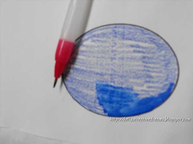
And finally, the Gelato. This is my favorite because of the creaminess. They don't lose their intensity with the water.
 |
| Gelato |
One of the best YouTubes I've found is by thefrugalcrafter. This gal is just awesome. I love a lot of her techniques in the stamping/ art field. In this particular link, I think I liked the background better before she blended it around. But what an awesome addition to using your EB folders on solid CS. She also shows how to make your own Washi tape using masking tape and Gelatos.
As I put projects together with my Gelatos, I'll show them.
Creative Blessings!
~Kelly
Well this is pretty cool & I can't wait to see what you make with it!!!
ReplyDeleteMe either hehe
DeleteGreat post Kelly! I need to try mine out. I had bought the two pack with the stamp.
ReplyDeleteThat's how I got all of my colors, too. Cute little stamps perfect for keeping in my art tote.
Delete